From there, I found some great web designer sites. It was a real thrill since I saw sites that I would never have found otherwise. Let’s face it, I’m not part of the target market for 95% of sites on the Internet!
As I saw great website designs, it didn’t take me long to decide what I liked – hence the possible biases. I definitely am attracted to clean simple designs, with either lots of white or cream space but of course, some use of colour. I realised that I dislike predominantly black websites as well as very busy, cluttered sites. I do think though, that most of the black websites with lots of stuff on them are usually geared to young people.
Lounge Lizard
Here are some screen shots of what I think are cool site designs. The first three sites were all created by Lounge Lizard. It was difficult to keep my examples to three.
 |
| Lounge Lizard's website |
Their website is relatively easy to navigate. They showcase a lot of websites that they designed for clients. I particularly like their "case studies" section. I'm sure that it helps potential clients see themselves and gives them a feel for what the company can do. As a student, it gives me insight into how these sites were developed.
Alakef Coffee Roasters
 |
| Alakef home page |
The site is very easy to navigate. They have their online shop as well as a very thorough section about coffee, called “Become an expert” which even includes a quiz. There is a good video explaining the company’s coffee roasing process that highlights their passion for great coffee.
Sedoni Gallery
 |
| Sedoni Gallery home page |
The look of the page, with the uneven black border accentuates the products on the page. The swipe of paint behind the “Welcome”, “Gift Registry”, “Gift Card” and “Shopping Bag” (instead of a cart) make the navigation obvious while looking artistic and carefree. The website highlights the assortment of textures to be found in the gallery through the use of a wonderful textured background and a navigation bar (at the top right) that looks like it’s on sand.
The headings for each product section are striking. They illustrate the section with a rich, beautiful look that is very much in line with their upscale clientele.
Bastian+Skoog Flower Studio
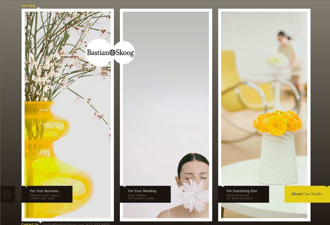 |
| Bastian+Skoog home page |
Here's a company, Eight Hour Day, that creates some great websites.Bastian+Skoog's website is pretty incredible. Of course, it's an upscale flower studio, so it probably needs to be incredible. I did find it a little difficult to navigate. At first I thought that it was my lack of experience using the web since I'm still not used to navigation buttons that slide in and out of the sides of the screen. However, after checking out the site a few times, their navigation depends on using the "back" button on the browser. A minor inconvenience, but I do think that users should have more than one choice about how they want to navigate around a website.

I'm showing this page because the yellow background was designed by Eight Hour Day. They did a yellow design like this for each page. I found these very compelling.
These are some of the designs I like. Why could that lead to biases? Well, these are designes that I like and am attracted to. That’s fine for my personal choice, but when we are creating a design for a specific audience, it’s important that the design is appropriate for that group. If I am a part of their target market, then it’s probably less of a problem; but if the market is teenages, then the designs I like are probably not suitable.
No comments:
Post a Comment