Tuesday 18 August 2015

Giving Learners Options Through Navigation

During the “How to Design an e-Learning Program” course from the University of Toronto’s Continuing Education, I used an e-learning project that I’m presently creating at work to apply the various concepts I learned. The course I’m designing is for employees who need to learn to post information on our corporate intranet using Umbraco.

I was able to think through the e-learning course that I’m designing in order to teach to two very distinct types of learners. I call these the Tech-Savvy Learners, those who are comfortable learning new programs; and the Nervous Learners, those who are intimidated by technology and are sure that this will be difficult to learn.

I didn’t want to create two distinct courses and I was hoping that it wasn’t necessary. I learned that giving learners options for how they wish to go through the course is often a matter of navigation. I haven’t had the chance to test my navigation with learners yet, so I hope that it’ll work out.


Essentially the Tech-Savvy learners can read the introduction and instruction pages and then go directly to the intranet test site to practice what they’ve learned. Anyone who wants more information, or who is more visual, can choose to watch a demonstration. They can re-watch the demonstration or re-read the instructions. When they are ready, they can go practice what they learned.

The Tricks and Tips section is highly recommended but a learner can always use the Table of Contents to skip whatever they want.

Monday 3 August 2015

Instructional Design Principles

It's done! Another course completed. This latest course was How to Design an e-Learning Program from the University of Toronto's Continuing Education. I have now completed 3 of the 5 courses for the E-learning Certificate. Yeah!

Even if I was familiar with most of the topics, it was great to learn about these in more detail. It turns out that following a few e-learning and design blogs has kept me up-to-date with what's happening. It was great to find other sources of information and inspiration through this course. I’ll be sharing some of these with you.

My intent was to write a post on what I learned in the course, but after reviewing my course notes and assignments, I have enough ideas for at least three posts. This is good news since this blog is neglected compared to my Quilting blog.

Here are some of the topics and ideas that stood out and how I’ve been able to apply some of these.

What I learned (Part 1):

Instructional Design Principles (or rules worth following when designing e-learning course)

My first assignment involved identifying instructional design principles to follow during the design of my project. Finding these on the internet wasn’t easy because they are rarely identified as principles. Here are some of my favourites, sorted by source. My observations are in the bullet
following the principle.
E-Learning by Design

E-Learning by Design by William Horton
  • Teach only what they “need to know”; what is essential; skills required in their jobs.
    • This can be difficult because we love learning and think everything is important. It’s not!
  • Ensure that they can skip what they already know and what they could learn on their own. 
    • The trick here is to make sure that they already know it or that they can come back if they find out they didn’t know it all.
  • Base the design on clear goals that are important to the organisation.
    • It was an interesting and worthwhile exercise to link the course goals to my organisation’s goals. 
Quick Survival Guide for Modern eLearning Designers
Quick Survival Guide 
A Quick Survival Guide for Modern eLearning Designers  (it’s a free download worth getting)
  • Use visuals to explain the content normally write out as a screen filled with bullet points.
    • An image can sometimes put the information in context. I really try to avoid the wall of words, whether it’s in e-learning or on the internet.
  • Every element of the design needs to have a purpose.
    • Excellent idea that applies to content as well as graphics etc.
  • If someone can say it better than you, then let them (link up to their blog, article or video).
    • Faculty Focus Blog
      Faculty Focus Blog
    • Not easy to do when things need to be bilingual but wise none-the-less.
  • Use a consistant format.
    • This is key for a professional looking product. Attention to detail is important here.
  • It takes longer than you think to create online content! 
    • Doesn't that apply to all project?
I’m not sure that I consciously kept these principles in mind, but I did use them. Not only are the principles relevant, but all three sources are excellent.

I hope that you have time to check these out!


Wednesday 27 May 2015

Graphics in Elearning

I know that the numerous authors are correct about the importance of appropriate graphics in an elearning program. The key word is “appropriate”. Just as in web design, using an image that is not relevant is worse than not having any.

Graphics or images need to be:

  • Relevant or appropriate;
  • Understandable; and 
  • Useful in the communication of the ideas presented.

An example of a clean layout with consistent font, colour and shapes
A clean layout with consistent font, colour and shapes
As much as images are required, I believe that it’s just as important to use consistent font, colours and shapes (such as buttons). This makes the elearning look professional and helps users know what to expect. 

The other point is to avoid at all cost the “wall of words”. Using images is one way of breaking things up. In my opinion the best way to avoid the wall of words is to keep the words to an absolute minimum. This is done by conveying what is necessary and leaving out the “nice to know”. I have found a great resource in Lisa M. Russell’s documents, including Clean the Clutter of your Words

I have been reading and using the book, White Space is Not Your Enemy (WSINYE) by Rebecca Hagen & Kim Golombisky. It’s informative with lots of examples, both good and bad. I highly recommend it.
White Space is Not Your Enemy book cover
White Space is Not Your Enemy

As for designing graphics, I seriously looked into learning software more technical than PowerPoint, the Snipping Tool and Paint. I use Photoshop minimally but I decided to spend my energy deepening my knowledge of design and development of elearning rather than graphics. At this time in my career, having some knowledge of web design is more important than becoming a graphic artist. If I need to, I can always hire a graphic designer.

What I've learned:
  • I can't learn it all, especially if there is a steep learning curve! Graphic design will have to wait for a next life.
  • I have a much better chance at becoming good at elearning and web design than graphic design.
  • It's still pretty amazing what I can do with PowerPoint, the Snipping Tool and Paint!

Friday 15 May 2015

Using Storyboards in E-learning Design

Storyboards were first used to design animation movies. They can also be useful in the design of e-learning. Storyboards come in all types of format - from paper, to Word or PowerPoint documents, to specialized storyboard tools such as Storyboard That
The Purpose of Storyboarding
For some interesting background, here is a great YouTube video, The Purpose of Storyboarding
I first started using storyboards about 5 years ago, after beginning to design my first e-learning course in PowerPoint (based on Jane Bozarth’s first edition of Better Than Bullet Points: Creating Engaging e-Learning with PowerPoint). I was having a great time creating an e-learning version of an in-class course I had created and taught but it wasn't clear where I was going with the course. After reading Connie Malamed's blog about storyboards, I downloaded the examples of storyboards found in her Storyboard Depot, adapted one and started using it.
I realise that I use a combination of storyboarding and designing directly in Adobe Captivate. After reading the articles on storyboards and wireframes (they are mostly used to design websites), in my How to Design an E-learning Program course, and watching the above video, I realise that I don’t use storyboards in a visual context. For me, it’s all about the content (text) and the flow. The visuals come later.
Storyboarding the Menu
After doing my initial research into my learners and what they need to know, I write a first draft of my learning objectives. This is where I also figure out if I can do the work in one module or if I should have a series of modules. I use good old fashion paper to get this done.
The Menu in Adobe Captivate
The Menu in Captivate
From my potential objectives, I prepare my introduction as well as plan out how to develop the module using the storyboard. I use the storyboard until I'm comfortable with my outline and where the module is heading. Once I have a path for my module, I usually start working in Captivate. My transfer from storyboard to Captivate is pretty intuitive. When I am doing more word smithing than planning, that’s usually where I go to Captivate.
I may end up doing the rest of the course directly in Captivate, but at one point I go back to the storyboard and copy the text, instructions, etc. from Captivate into it. I do this for a few reasons:
  • It's easier for the editor to review the course in the storyboard format;
  • I indicate the types and colour of the text boxes, info on the visuals and buttons I used as well as other techniques such as roll-over captions within the storyboard;
  • After potential students and my colleagues review the first published version of the course, I make the suggested changes in the storyboard. I use this version to make sure that everything is consistent. Then I make the changes in Captivate.
  • Once completed, I forward the storyboard to the translators. I put everything that needs to be translated in French in red within the storyboard;
  • Once it's translated, I copy the French text in a copy of the original version of the module in Captivate;
  • The French storyboard gets revised by the editor and I make the final minor changes to the French Captivate version.
I like using both the storyboard and Captivate to design my e-learning courses. 
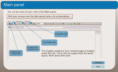
Storyboarding the Main Panel Page

The Main Panel page in Adobe Captivate
The Main Panel Page in Adobe Captivate
 What I've learned:  

  • It's important that I not get bogged down with using a specific tool because I "should" rather than what works best for me.
  • I don't spend time with the visuals in my storyboard because honestly I can't draw (free motion quilting doesn't count) and I know that I would spend all of my time on the visuals. Visuals are important, but they have to support the ideas. It's best if I do these after I know where I'm going.

Friday 8 May 2015

Why E-Learning? Why Not?

I have just started another e-learning course through the University of Toronto's Continuing Education. This one is How to Design an E-Learning Program. The first week is essentially an overview of the other two courses I've taken - Visual Design and Display of Information, and Writing for the Web.

My first discussion topic is:
Comment on a few of the advantages and benefits of e-learning in terms of why you might choose e-learning as your educational medium, and list specific advantages and benefits that impact the program you will be developing as part of this course.
Here's a quick summary of the program I'll be developing in this course:
  • Posting on the Intranet Using Umbraco is intended for employees who are tasked with posting content on the intranet. The intranet platform, Umbraco, is relatively easy to use for most simple posting tasks.
  • Employees are located across the country and presently get personal face-to-face training / coaching when possible. Otherwise, I use a combination of web-ex and conference calls.
  • Front page of the Posting on the Intranet Using Umbraco Program
    Front page of the Posting on the Intranet Using Umbraco Program
  • There are only a few employees in each business unit who post on the intranet, however there is often a very high turn-over for performing these tasks since it is often in addition to the rest of their regular jobs.
Advantages and benefits to having this program be delivered through e-learning:
  • Convenience: employees will be able to follow the course at their desk, where ever they are. No more scheduling of boardrooms, web-ex and conference calls.
  • Flexible: they will be able to access the parts of the course that they are interested in or are having difficulty with. 
  • Self-paced: Instead of learning the basics within a two-hour time frame, employees will be able to stop the training when they feel they have had enough at the time.
  • Economic option: it is not feasible to keep teaching/ coaching employees one at a time, or in small groups. Eventually another method of delivery will be required.
  • Consistent with the skill sets of the employees: employees who will post on the intranet are usually quite comfortable with technology. An e-learning program will not be outside of their comfort zone.
What I learned in this first week:

  • It's going to take me more than one day a week working from home to complete all the readings and assignments for this course!
  • I read a few articles on the difference and effectiveness between e-learning and face-to-face training. The bottom line is that e-learning can be as effective or as bad, as face-to-face training. The quality of the training is generally based on its design and how it addresses the learning needs of students. 
  • I discovered a couple of MOOC (Massive Open Online Course) websites. I had found one website but the course I wanted was neither free or nor available in Canada. I've now registered for the course, Leaders of Learning with edX. It's a course in their archive which suites me better since I can do it at my own pace.  I suspect I may have my hands full with my Design course. I was also intrigued with Coursera. There have less archived courses and more actual asynchronous online courses. 
Wish me luck!

Monday 26 January 2015

Creating Navigation Tabs

Beautify Your Blog button and table of content
Beautify your Blog
The next lesson on Erin's Beautify your Blog series is 5. Navigation Tabs. I've been thinking for a while about adding more pages to my blogs. Of course, it's important that the tabs link to related and interesting pages. To that end, I've been noticing what types of additional pages bloggers have on their sites. Here are some of the additional pages that are often found on quilting blogs:
  • Quilting Tips or Tutorials;
  • Link to their e-Shop, patterns for sale, etc.;
  • Linking Parties (that they created or participated in); 
  • Quilts and Projects (either in-process or finished);
  • Quilt-Alongs (that they created or participated in);
  • Speaking,Teaching and Events (especially if they are professionals);
  • About Me;
  • Quilt Gallery or Finished Projects (photos of finished quilts) (some divided by year); and
  • Helpful Hints (theirs or links to other resources).
Here are some neat ideas about other possible pages:
  • UFO Management; 
  • Events that they are attending;
  • Annual Plans (usually UFOs and UFO Challenges);
  • Quilt Journal (links to all of the blogs related to a finished quilt);
  • Ideas for future quilts (lists, links, pictures, sketches, etc.);
  • Interesting Resources (on the internet, books, etc.) about design, FMQ; 
  • Quilting Bloggers around the world;
  • Specific interest pages such as techniques, products like journal covers or purses, original designs, etc.; and
  • Specific Projects or a series, etc. (that they created or participated in).
I've been doing some research on the design blogs out there. Many are created by professional designers who have companies, so it's difficult to use them as examples of the types of pages I might want to add to my design blog. I guess the real issue is what is the purpose of the blog. For me, it's about recording my learning journey in design, be it for web, blog, e-learning or anything else. As I keep looking at design blogs, I'll be able to get a better sense of what I will want for the Design blog. I'm slowly making my way though the Top 100 Design Blogs To Follow by Ciera Design.

Technically you don't want to create and publish navigation tabs if they don't link to anything....that's why I started this process in the test site. I'll be creating potential navigation tabs and showing them off in this post, but will only upload them on my "real" site as I create actual pages to link to.

Erin suggested that when creating navigation tabs, that the image for the navigation tab should be about 50px high or less.  I did create a button using the image above but when I went to post it on Photobucket, it didn't let me download just one photo, but rather, it downloaded my entire folder. I was not impressed. It may have been my fault, but after that, I wasn't in the mood to keep at it. Maybe one day when I have more patience, I'll try again.

So, I did what everyone does....I Googled it! I found a web site that said that I can use a gadget for my navigation bar. That sounded good to me. When I searched the gadgets, it wasn't really obvious, but here it is. It worked really well and was fairly easy to install. Now, I just have to figure out what I want to place in my navigation bar.

What I learned:
  • It's not a good idea to play with new apps when I'm impatient! On the other hand, it did lead me to find an alternative to creating my own navigation tab. 
  • I know that I at least want to link my two blogs together. I'll be able to do this and still keep their design distinct.
  • I don't really need an "about me" section, but like Erin said, it is easy to create.

Wednesday 7 January 2015

Working on a Header

Weeks 3 and 4 of Beautify your Blog is about the header. I'm looking forward to these because so far I'm not really impressed with the backgrounds that I've chosen. I know that once I create a header that I like, that I will probably have to use a more neutral background.

Here are a few things that Erin suggests:
  • If you've adjusted the width of your blog, then you'll want a header that is roughly 1000px wide. The height of the header should be about a third of the width, so in this case, 300px or so.
  • Use only a couple of fonts and match your background colours.
I ended up making a large number of headers. I love making these. I've been using PowerPoint to make my own images for years. It's simple to put images together and then add text. One thing that I've learned is that it's best to do this within a coloured box, even if that colour is white. Unless I'm going to use just one background image, the first thing I do is create a white rectangle with a thin border. I then add my images and text boxes. Once I'm done, I save the entire group as a JPEG image. After the image is saved, it's easy to place it where you need it, and then, if you don't like something, to go back into PowerPoint to make changes. That's why I always save my PowerPoint file - you never know when you'll have to go back and make changes.

Here are some of the headers I've tried out on the Test site.
Header with two large images and centered name

In my header I've used a number of images. This example contains two larger images, one of them within a round frame. The blog name is large and in the middle, and as Erin suggested, it contains two fonts and two colours that fit with the background.

Header with round images and smaller name


In this example, I used a number of images within round frames. The blog name is smaller and located under the smaller images.


Header with images in square frames

This header is similar to the above example but the images are within a square frame with rounded borders. There are less of them and they are slightly larger.

You will notice that the background is different. I tried taking a picture of fabric and using these as background. This was my favourite one, but I'm not sure that it's required if I have an interesting header.

Header for Learning & Design Blog

I wanted to try something totally different for my Learning & Design blog. (You may have noticed that the other images are for the Quilting & Learning blog.)


Header with different fonts


This is a similar header with  different fonts and a different background colour. I found the design, Stitches, on the Starsunflower Studio site that Erin suggested. The design is by Jan Kopriva.


Header with an overall image
I've just added a different header for the Learning & Design blog. It took a while to get it right because it turns out that even if you make the background the correct size (970px), when you open it up in PowerPoint, the size will change.

The image is Winter Leaves, designed by Nathalie Ouederni from France. I found the image on the Smashing Magazine website, as part of their Desktop Wallpaper Calenders: January 2015 series. Isn't it great? If you go to Nathalie's site, you can download wallpaper from this image.

What I learned:
  • If you want to put writing within your image, you have to have a uniform section to write in, otherwise you'll only see the writing in some sections and not others.
  • Details such as font, font size and the frames around images can make a lot of difference.
  • Bringing an image into PowerPoint changes its size!
  • Working with a width of over 1000px makes aligning images much more difficult within a post. I ended up going back to 970px.
  • Getting the same colour background for my test site and this site was very difficult. It turns out that if you want to change the background colour to something specific, you should go to the "Advanced" setting/ "Backgrounds" and then change the "Outer Background".
  • The hard part is choosing! Should I keep making new headings or just choose one?  
If you have any preferences, please let me know!